Collibra Data Quality
Transformational redesign of a standalone data quality app during platform integration celebrated by users.
Collibra
- Deep redesign of all core tasks and screens
- Figma prototype creation and user research support
- Led design feedback sessions with customer success
- Supervised 1 designer
Staff Product Designer
Rapid redesign and migration
The Owl DQ acquisition had powerful and popular capabilities for automatically monitoring data anomalies using machine learning but it had never been fully integrated into the Collibra platform. Market needs to offer a cloud option led to the decision to rebuild the frontend in platform while preserving the backend. This was also a tremendous opportunity to rebase UX that had become cluttered over the years, create deeper cross-functionality with other data governance features, and add new automations. Urgency to rapidly migrate the entire app was high so that the the time spent offering and maintaining two separate products was minimized.
The team brought together a director of product with broad expertise in the DQ space, a staff product manager who had been working with the app for years, myself who was deeply familiar with the platform, and a role level designer. We started with reviewing current flows, pain points, and competitive analysis. With this background, we reimagined the information architecture, defined a schedule of 2 week design sprints, and created an outline of new surfaces.
Following the schedule, we met weekly to wireframe, critique, and debate, with engineering implementing a sprint behind us. To keep the UX confidence high, we gathered feedback on the designs in each sprint from customer success. Midway through, we tested a clickable prototype with 10 users and then ended with a beta.
The massive changes to the rearchitected app were embraced by users as "intuitive" and "clean" with 78% of beta testers calling it easy to use, and 50%+ of customers joining the early adopters program signalling their intent to migrate.
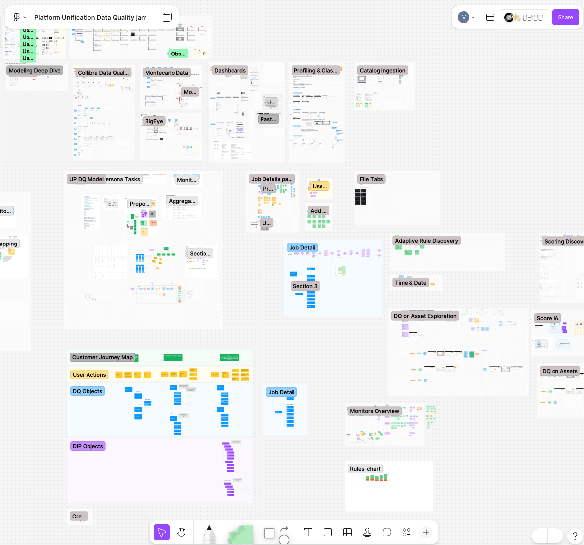
Design sprint planning in Figjam
Navigation streamlined
The legacy app made it difficult to know where to start or see your monitoring coverage and alerts were buried. I simplified and reorganized it so an overview of the data landscape where you could seamlessly add monitoring was the home base.
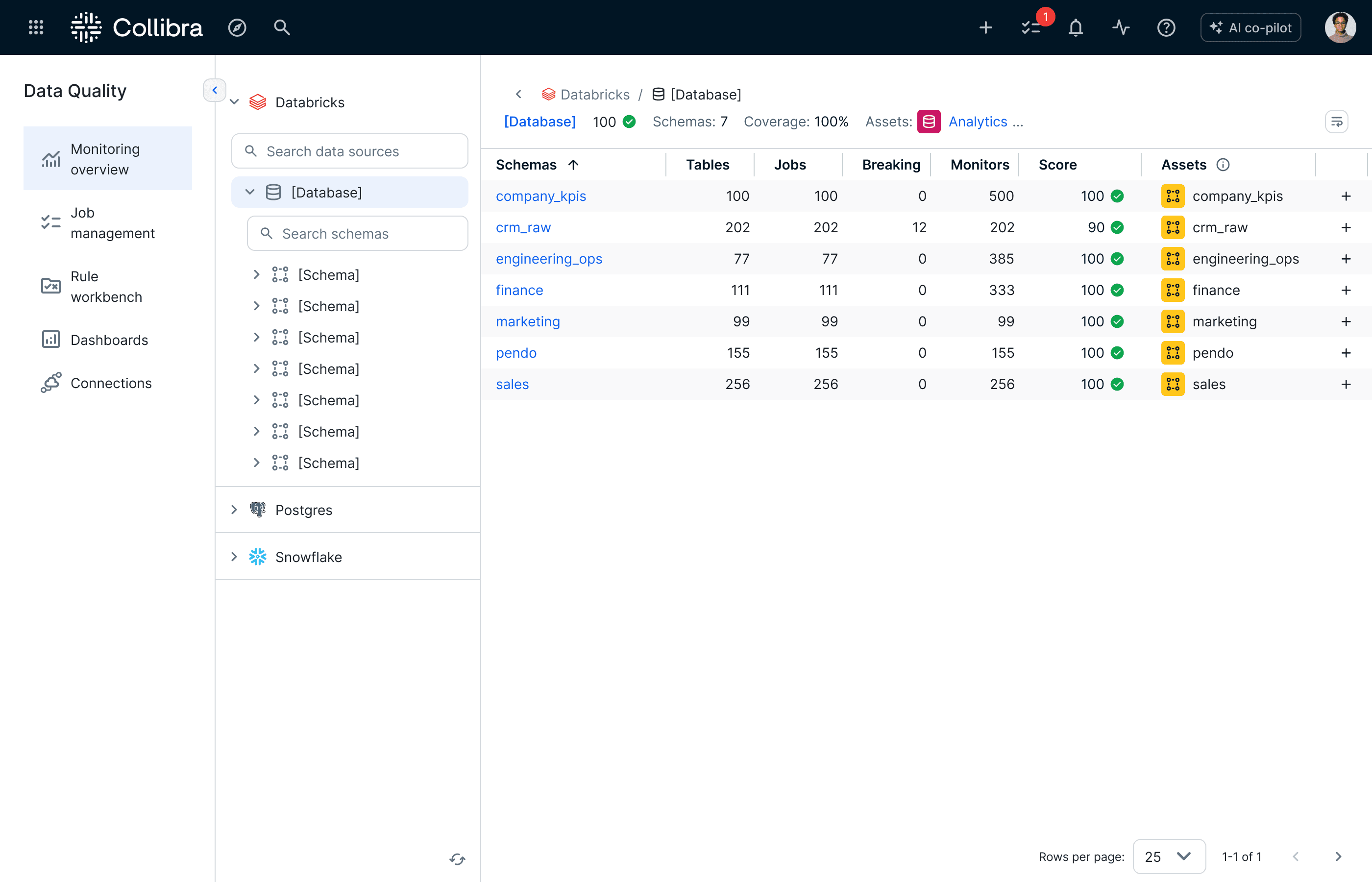
5 intuitive menu options based on task alongside the data landscape with monitors and scores
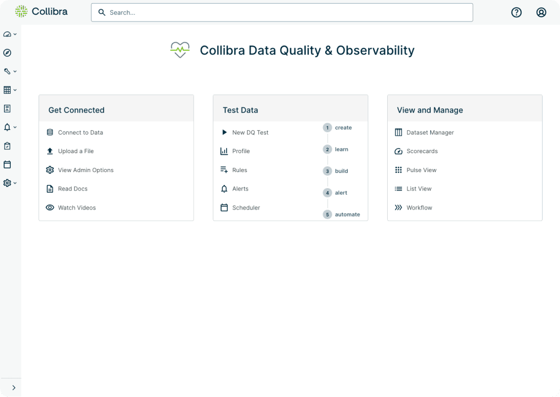
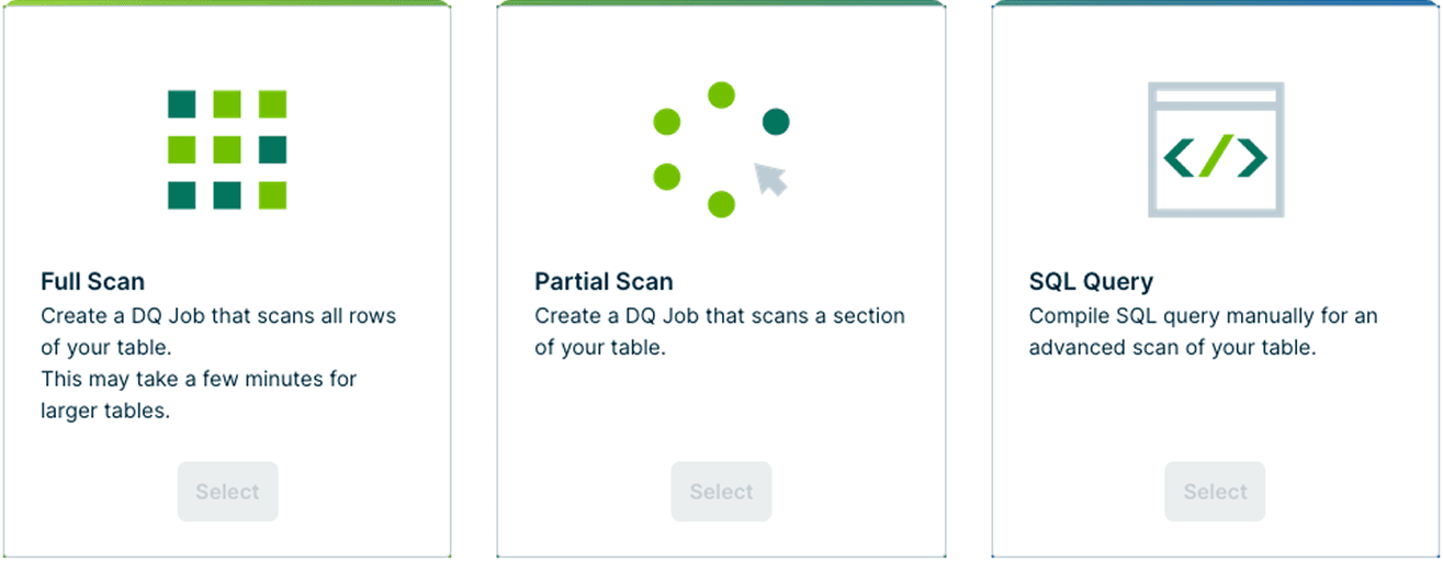
3 create data quality jobs unified
There were 3 separate options for creating a data quality job but they were 90%+ the same flow. I consolidated them into one so it was easier to create and evolve monitoring.
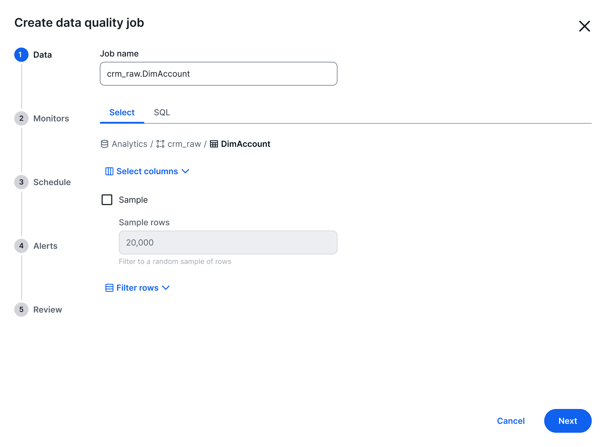
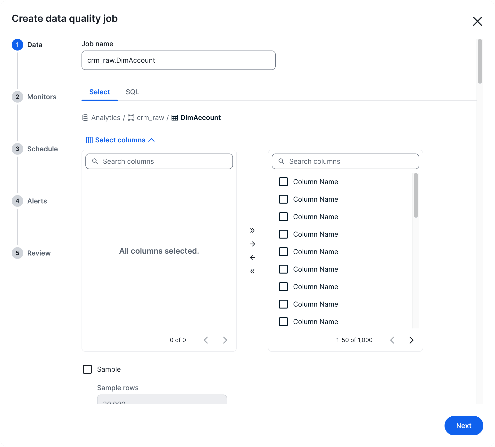
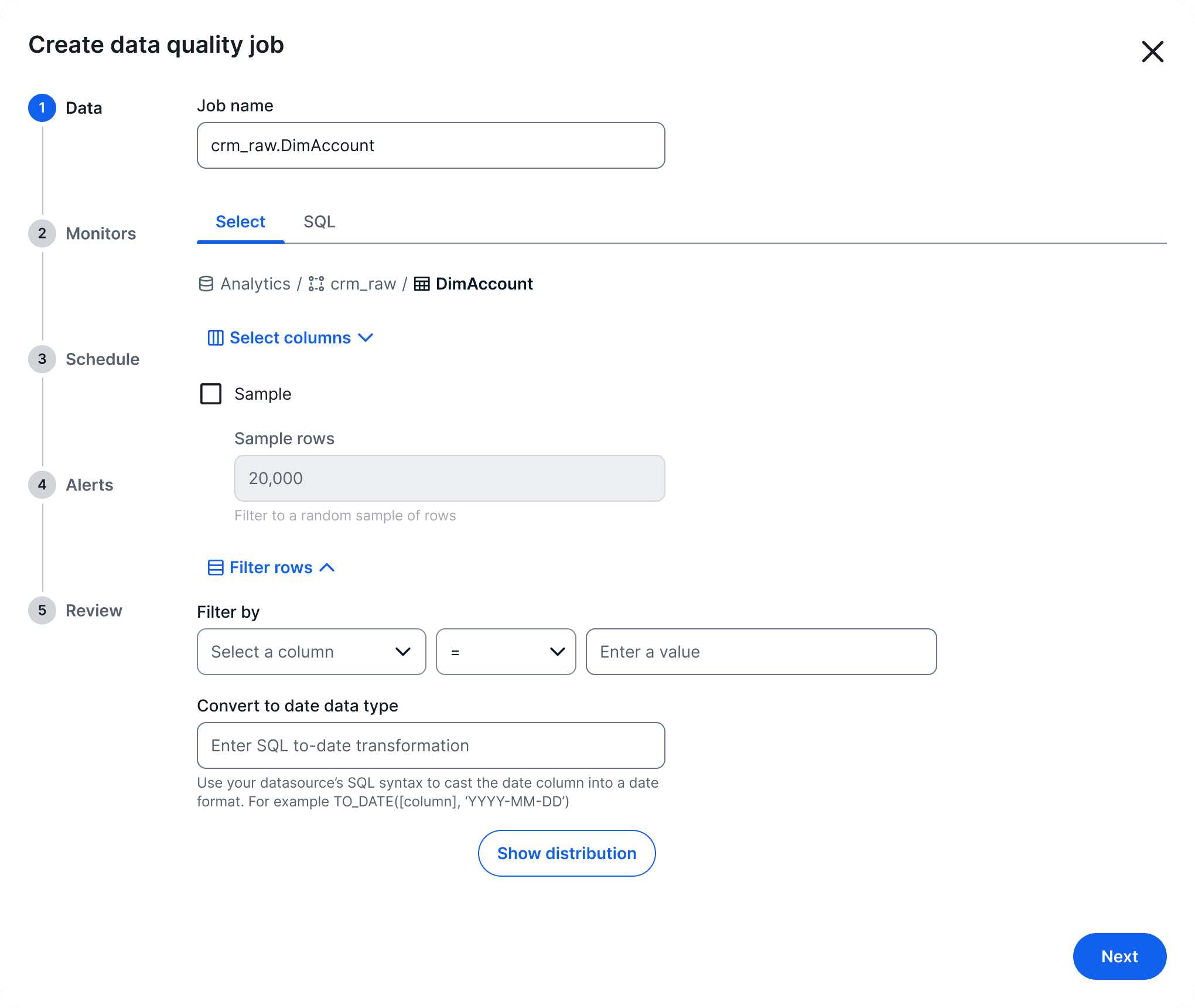
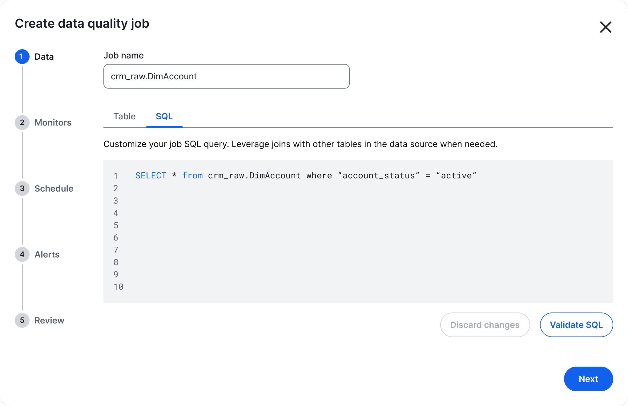
Default state, monitor all the data in the table
Data quality job details clarified
It was hard to tell what was the most important information in the classic page for details about the data quality job. To fix the information hierarchy, I moved secondary information into a collapsible sidebar and unified the metrics into one graph with calmer color. The breaking monitors were sorted to the top of a combined table rather than hidden on 9 tabs.
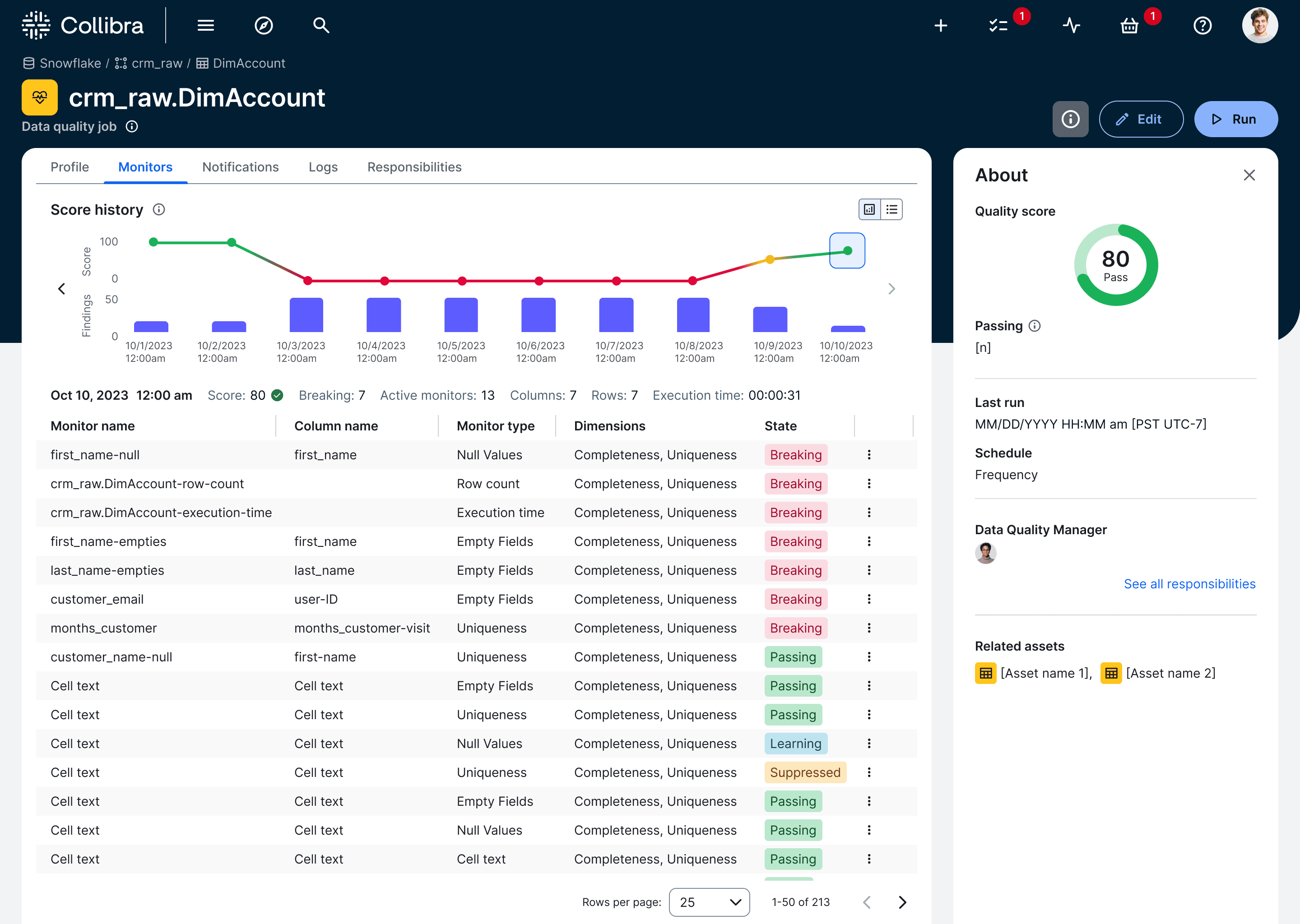
The breaking monitors are now sorted to the top of the table
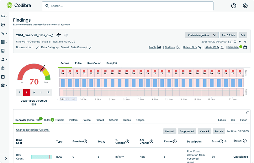
New AI and automations
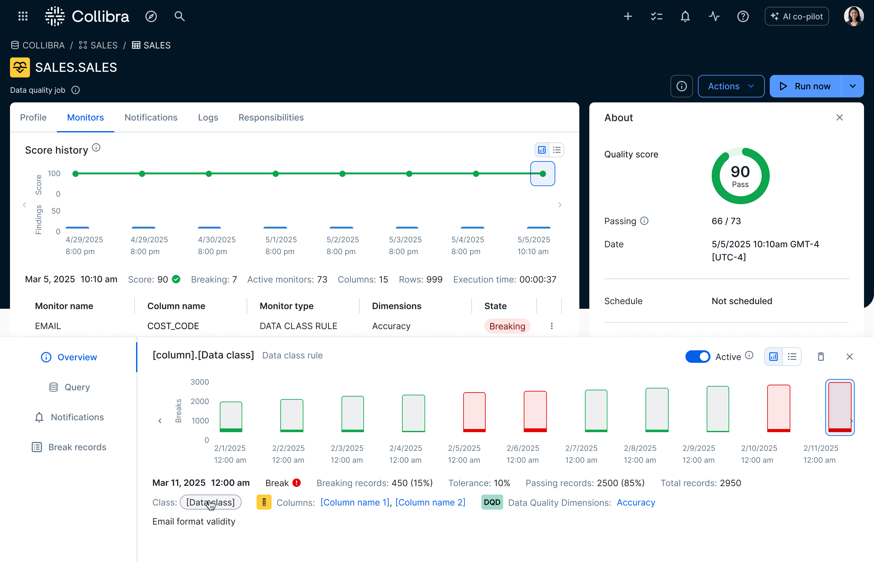
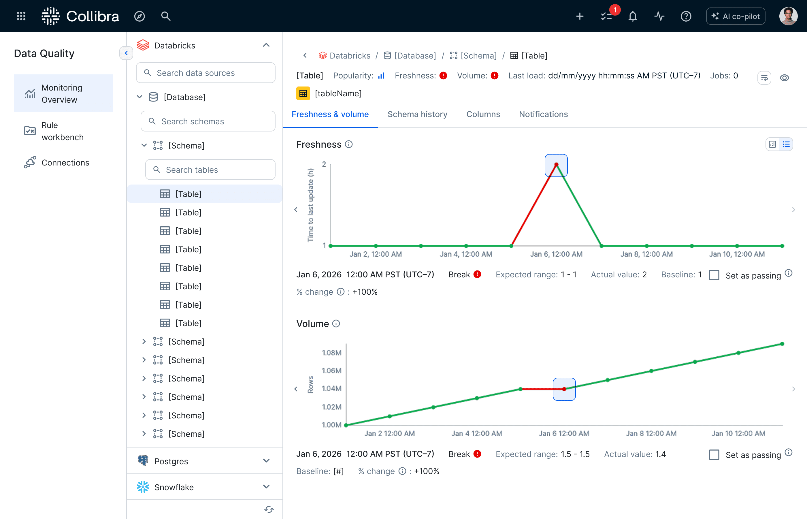
More than improving existing UX, we also built new ways to speed up creating data quality monitoring with AI drawing on contextual data governance knowledge. Automation was added for: writing SQL rules, detecting classes and adding rules for them, and establishing broad baseline monitoring using data source metadata.
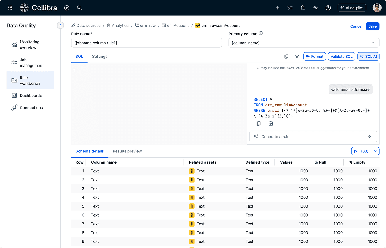
Schema-aware generation of SQL data quality rules
Beta users celebrate the improved experience
Despite beta implementation bugs, the majority found the overhauled experience easy to use with the new UI described as "clean", "very easy to understand", "easy to navigate", "incredibly fluid."
78% agreed with the statement, this product was easy to use.
“
In our current environment, there are a lot of high technical rules that are configured and every job must be setup and monitored by highly trained developers. The walk thru was simple and easy to understand and I feel like it will allow us to implement simple rules and refine them to be more complex (as needed) over time.
beta tester